
Recoup Shopify Website Redesign & CRO
Creating a Fresh, Conversion-Focused Shopify Experience for a Functional Beverage Brand
Service
UI/UX Design, Shopify Development, Conversion Rate Optimization, Responsive Design, SEO Improvements
Industry
Functional Beverage, Wellness & eCommerce
Platform
Shopify
Website
http://drinkrecoup.com/
Project Overview
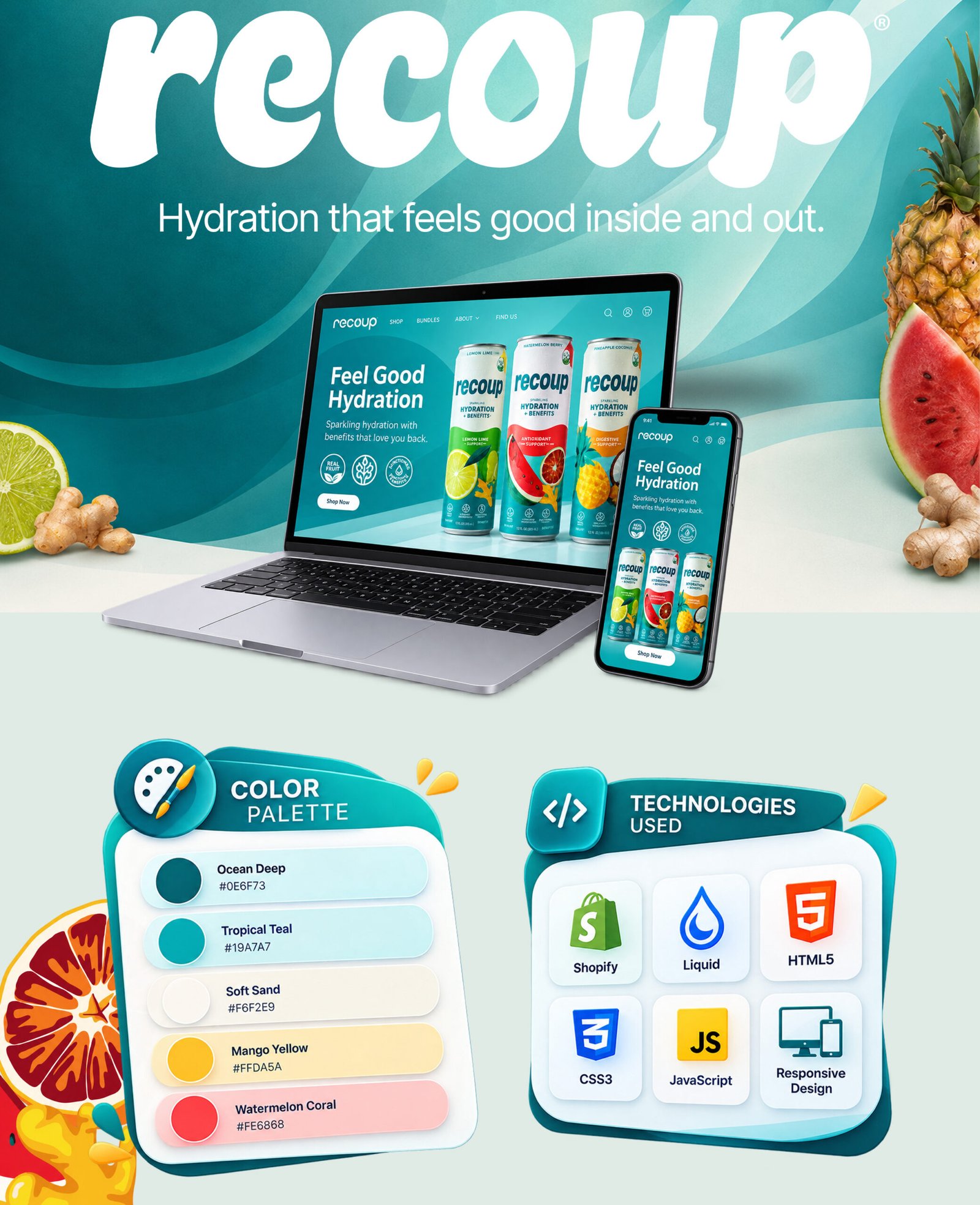
Recoup partnered with Codmash to redesign and optimize its Shopify website with a stronger focus on ecommerce usability, brand presentation, and conversion rate optimization. The primary objective was to create a modern, responsive shopping experience that clearly communicates Recoup’s functional hydration benefits, product flavors, ingredients, and wellness positioning while making it easier for customers to discover and purchase products. Recoup’s product positioning includes natural electrolytes, real ginger juice, fiber for gut support, and functional beverage flavors such as Lemon Lime, Watermelon Blood Orange, and Pineapple Passionfruit.
As a Shopify design and development partner, Codmash handled the website redesign process including UI/UX improvements, responsive development, conversion-focused layouts, product presentation, content structure, performance improvements, quality assurance, and ongoing website enhancements. Every part of the project was designed to create a stronger ecommerce experience while supporting long-term brand growth.
Our Approach
The project started by understanding Recoup’s products, customer journey, brand identity, and ecommerce goals. We focused on creating an experience where visitors could quickly understand what makes Recoup different, explore available flavors, learn about key functional benefits, and move naturally toward purchasing.
Our design approach used Recoup’s existing visual identity with clean layouts, product-focused photography, strong typography, organic wave elements, and strategically placed calls to action. Product discovery, benefit communication, ingredient storytelling, lifestyle content, and trust-building elements were organized into clear sections. The Shopify development was implemented with responsive layouts and reusable components to support future content and product updates.
Before launch, the website was tested across desktop, tablet, and mobile devices to validate responsiveness, navigation, product interactions, content presentation, and overall functionality. Additional improvements were made to website performance, user experience, and conversion-focused elements.
Challenges & Solutions
The main challenge was balancing Recoup’s educational wellness content with the needs of an ecommerce website. Visitors needed to understand benefits such as natural electrolytes, real ginger, fiber, regenerative maple tree water, and the differences between individual flavors without making the shopping experience feel complicated.
To solve this, we simplified the information architecture and transformed important product information into easy-to-scan sections using icons, product cards, short benefit statements, lifestyle imagery, and clear CTAs. Product visibility was improved throughout the website, while ingredient information, certifications, brand storytelling, and educational content were positioned at relevant points in the customer journey. Responsive layouts and optimized content presentation also created a smoother mobile shopping experience.
Results & Achievements
The redesigned website created a stronger and more consistent ecommerce experience for Recoup by combining product education, brand storytelling, and conversion-focused Shopify design.
Key project achievements include:
- Redesigned the Shopify experience with a modern and consistent visual direction.
- Improved product and flavor discovery through clearer ecommerce layouts.
- Strengthened product benefit and ingredient communication.
- Created responsive layouts optimized for desktop, tablet, and mobile.
- Improved CTA placement and customer pathways toward product purchase.
- Developed reusable Shopify sections for easier future website updates.
- Improved content organization across product, educational, blog, and supporting pages.
- Created a stronger foundation for ongoing CRO, SEO, and ecommerce growth.
Technologies & Services
This project combined Shopify development, UI/UX design, responsive implementation, and conversion-focused ecommerce optimization to create a modern digital experience for the Recoup brand.
Services Provided
- Website Strategy & Consultation
- UI/UX Design
- Shopify Website Development
- Shopify Liquid Customization
- Responsive Web Development
- Product & Landing Page Design
- Conversion Rate Optimization
- Ecommerce UX Optimization
- Performance Optimization
- Search Engine Optimization
- Quality Assurance & Cross-Browser Testing
- Ongoing Website Support
Project Gallery
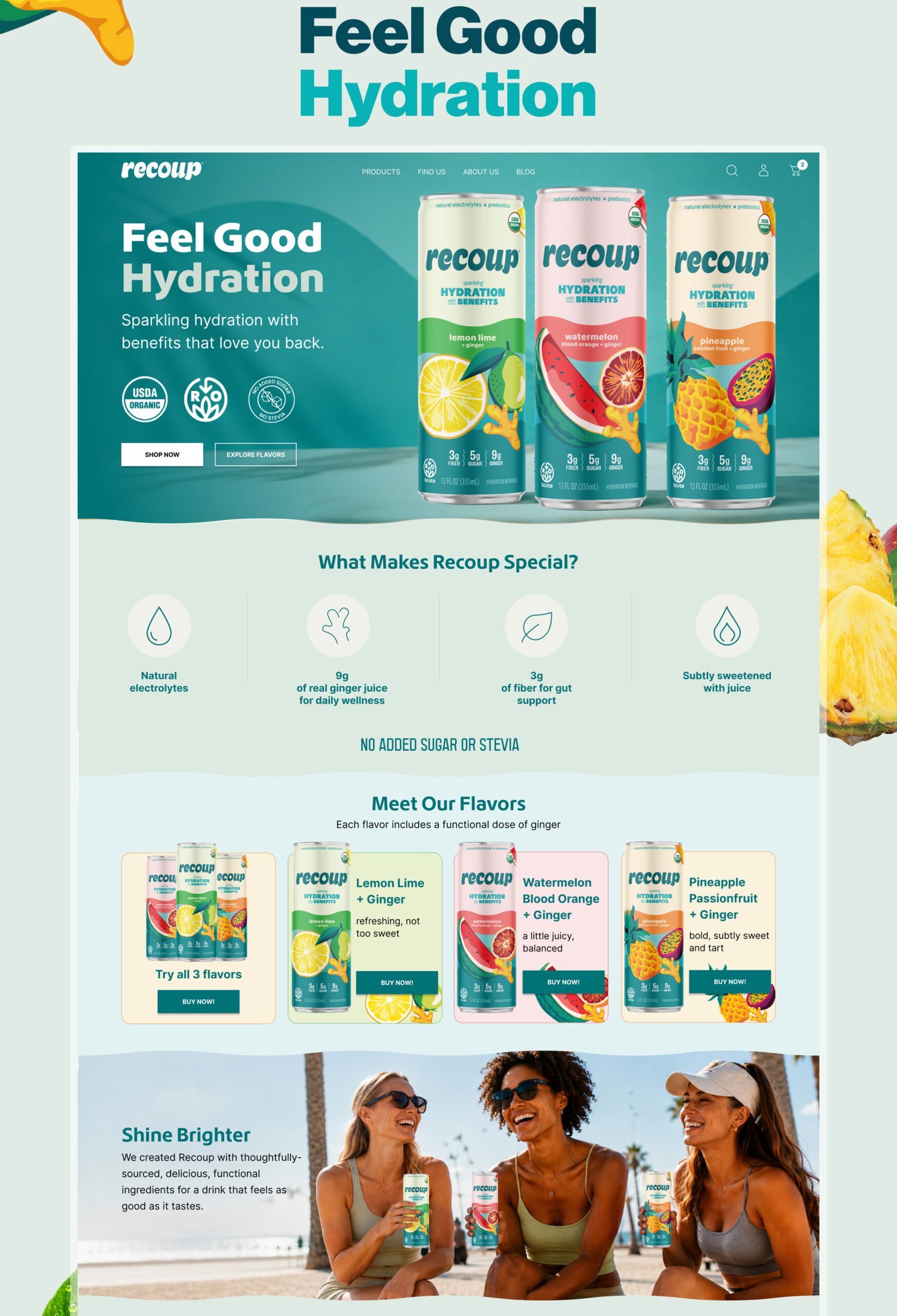
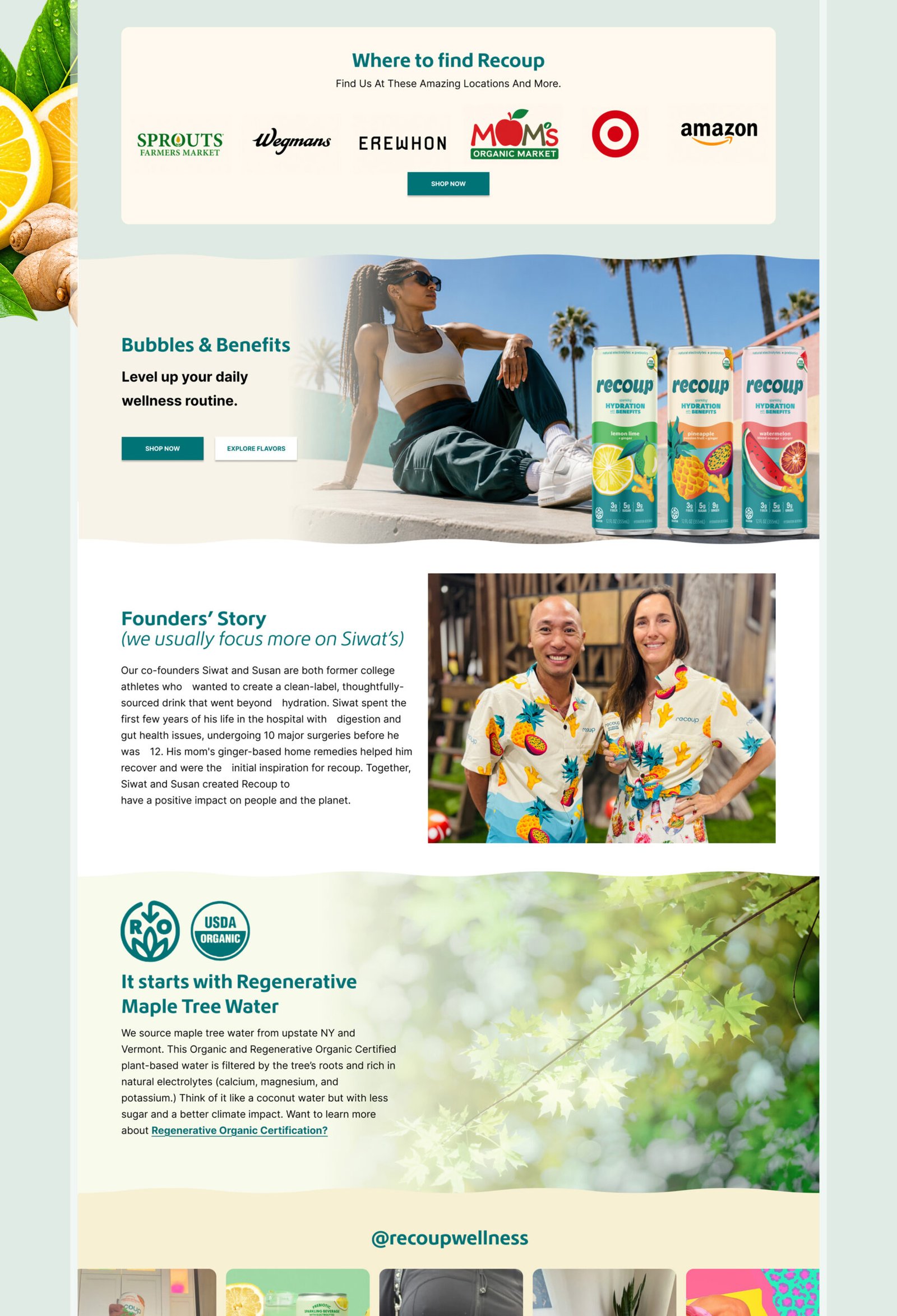
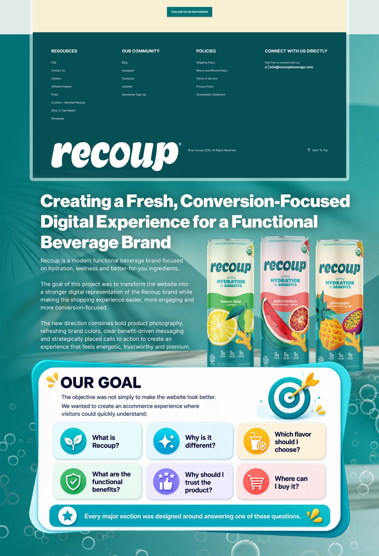
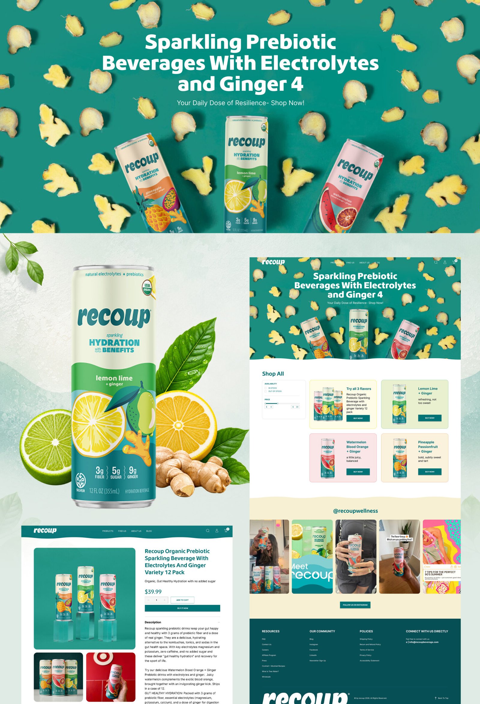
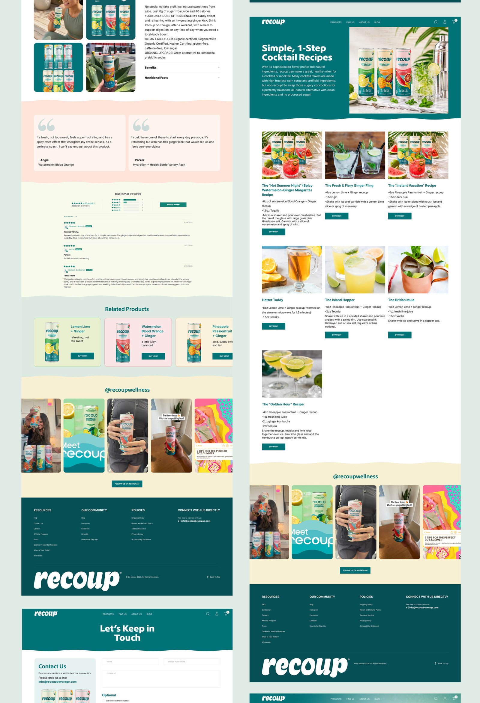
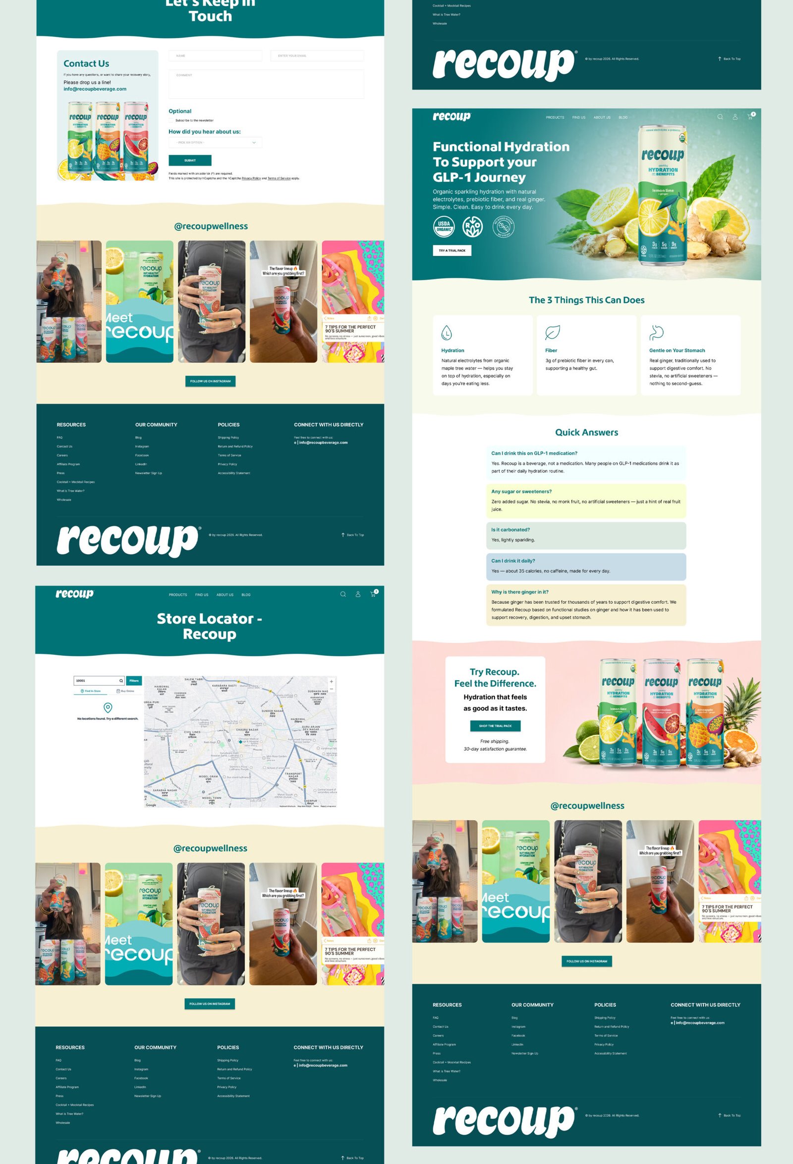
The primary objective was to create a stronger ecommerce experience that clearly communicates what Recoup is, what makes the brand different, and why customers should choose its functional hydration products. The redesign focused on improving visual hierarchy, product discovery, trust, mobile usability, and conversion pathways while keeping the website aligned with Recoup’s fresh and wellness-focused brand identity.
Shopify provided the flexibility Recoup needed to manage products, collections, content, promotions, and future ecommerce growth from one scalable platform. It also allowed us to create reusable sections, customize product experiences, improve mobile responsiveness, and build conversion-focused layouts without making day-to-day content updates difficult for the internal team.
The project covered much more than the homepage. We worked across product pages, collection and shop experiences, educational landing pages, flavor discovery sections, blog layouts, recipes, FAQ, contact, store locator content, and supporting brand pages. The goal was to create consistency across the full customer journey rather than improving only a few isolated screens.
We reorganized product presentation so visitors could understand the available flavors and product benefits more quickly. Product cards, flavor descriptions, imagery, CTAs, and supporting benefit content were placed in a more logical order, helping customers compare options and move from discovery to purchase with less friction.
CRO improvements were built into the page structure instead of being treated as a separate layer. We focused on clearer CTA placement, stronger product visibility, benefit-led messaging, trust signals, reduced visual clutter, improved content hierarchy, and more natural transitions between education and purchase. These decisions were designed to make the shopping journey easier and more persuasive without making the website feel overly sales-focused.
Recoup has several important differentiators, including hydration support, natural electrolytes, real ginger, fiber, ingredient quality, and wellness positioning. Instead of presenting this information in long text-heavy sections, we used icons, short benefit statements, visual content blocks, product imagery, and structured sections so visitors could understand the key benefits quickly on both desktop and mobile.